


Top Posts

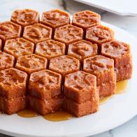
Purple Honey Is Real, and It Only Comes From One Place on Earth
No, it doesn’t come from purple bees.

Starbucks’ Refreshers Just Got Hotter
We got an advance taste of all three “swicy” lemonade-based sips.

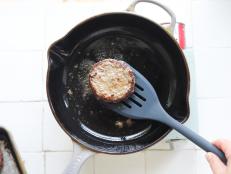
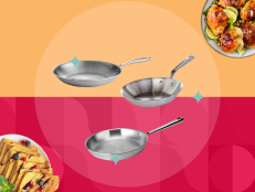
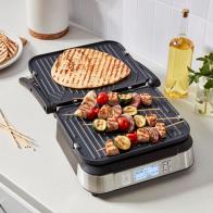
How to Prevent Food From Sticking to Your Stainless Steel Skillet
Avoid these mistakes and your food will never stick again.

Taco Bell’s Nacho Fries Are Back With a Bold Upgrade
Just NowThe fan-favorite menu item is coming back April 25. This time, the chain is teaming up with beloved hot sauce brand Secret Aardvar …

‘Zero Sugar’ Ginger Ale Recalled Because It’s Full of Sugar
PepsiCo is voluntarily recalling 233 cases of Schweppes Zero Sugar Ginger Ale.

Would You Recognize the Smell of McDonald’s Fries Anywhere?
The chain wanted to see if it could advertise with scent alone.
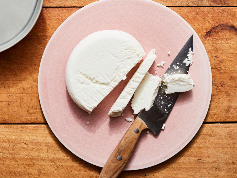
I Promise Making Your Own Paneer Is Worth It, and It’s Way Easier Than You Think
Yes, I make cheese from scratch, and so should you!

Dr Pepper’s New Creamy Coconut Flavor Is Sunshine in a Can
The brand says it’s the only coconut-cream-flavored dark soda on shelves.

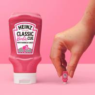
Barbecue Sauce Gets the Barbie Treatment
The vegan mayo-barbecue sauce mashup is Barbie pink.

Starbucks’ Refreshers Just Got Hotter
We got an advance taste of all three “swicy” lemonade-based sips.

How a Vietnamese Bakery Started by Refugees Became a New Orleans Destination
On the outskirts of The Big Easy, people will line up down the highway for Dong Phuong Bakery’s king cakes and more.

The Name of This TikToker’s Homemade Snack Will Make You Giggle
What are “chippy boys,” anyway?

Purple Honey Is Real, and It Only Comes From One Place on Earth
No, it doesn’t come from purple bees.

11 Food and Restaurant Chain Deals to Get You Through Tax Day
These discounts and freebies will help with the last-minute crunch or submission celebration on Monday, April 15, 2024.

Love Hot Pot? Have You Met Its Lesser-Known Cousin?
Dry pot’s got all the customizability of hot pot, minus the soupy broth.

I Tried Cup Noodles’ Most Mind-Boggling Flavor to Date
The brand’s Everything Bagel instant ramen isn’t just sprinkled with seasoning – it’s creamy, too.

The Secret to Perfectly Frosting a Cake Is in Your Microwave
This simple TikTok hack could seriously level up your cake decorating skills.

Subway Finally Gives Wraps a Second Thought
I tried the chain’s new signature wraps, made with new lavash-style flatbreads.

10 Can’t-Miss Deals for The Solar Eclipse
Get ready for the moment with glasses, and plenty of snacks.

Selena Gomez Takes Her Culinary Journey to the Next Level in All-New Series Selena + Restaurant
The series premieres on Thursday, May 2 at 7|6c on Food Network and will also be available to stream on Max.

Would You Dye Your Hair Velveeta Cheese Gold?
The brand is releasing a semi-permanent hair dye. And no, the very real product isn’t an April Fools’ Day joke.

If You’re Going To Make a Crookie Yourself, Be Sure To Use This Type of Cookie Dough
Chocolate chip cookie-fied croissants from France are all the rage on TikTok. But if you can’t make it there, here’s a tip from ou …

KFC Offers a Fresh, Tiny Take on the Fast-Food Hand Pie
Apple Pie Poppers are heading your way — and we got an advance taste.

10 American Bakers Say Bonjour to All-New Pastry Competition, Next Baking Master: Paris
Catch the series premiere on Monday, May 6 @ 9|8c.

Wendy’s Is Giving Out Cards for Free Breakfast Sandwiches for a Year
On April 1, April Fools’ Day, the first 100 people in line at more than a thousand locations across the U.S. will snag the coupon …

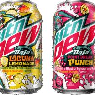
MTN Dew Releases Two New Baja Flavors
The original Baja Blast is celebrating its 20th anniversary.

Hostess Launches Meltamors, The First Snack It Explicitly Suggests Microwaving
While people have already been microwaving baked goods for a few seconds before eating – just ’cause – Hostess created a lava cake …

Jalapeños Are Getting Milder. Here’s How to Turn Up the Heat.
Pepper breeders are taming the chiles’ signature bite. We asked Food Network test kitchen recipe developers what you can do about …

Subway Is Bottling Its Signature Sauces for You To Use in Everything
The sandwich chain’s new sauce line features three customer favorites and a ‘new twist’ on a Subway ‘MVP.’

Fresh Ube Is Hard To Find in the U.S. – Here’s How You Can Still Cook and Bake With It
Cookbook authors Abi Balingit and Arlyn Osbourne give tips on sourcing and working with the vibrant purple Filipino tuber.

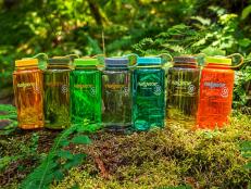
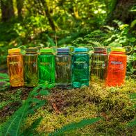
OXO Just Released Its Own Stanley Tumbler Dupe
And this stainless-steel water bottle is lead-free.

Walmart’s Great Value Brand Cashews Are Being Recalled
Sold in 30 states and online, the cans of nuts may contain ‘undeclared’ allergens.

PSA: You Can Get as Many Free Scoops as You Want on Ben & Jerry’s Free Cone Day
Yes, you can get back in line for another with an ice cream already in hand. This year, mark your calendars for April 16.